
Understanding Regenerative Blower Pressure and Flow Charts
In many industrial systems, airflow must be delivered with stable pressure, continuous operation, and precise control. Whether the application involves aerating wastewater, conveying materials through pipelines, or creating vacuum for handling equipment, selecting the right air source is essential for reliable performance.
One of the most commonly used solutions in these environments is the regenerative blower, valued for its ability to produce consistent airflow while maintaining relatively high pressure in a compact design. However, choosing the correct model depends heavily on understanding the pressure and flow performance chart provided by manufacturers.
These charts illustrate how airflow and pressure interact within the blower, helping engineers determine whether a specific unit can meet system requirements. Proper interpretation ensures the equipment operates efficiently while avoiding overload, insufficient airflow, or unnecessary energy consumption.
What Is a Regenerative Blower Pressure and Flow Chart
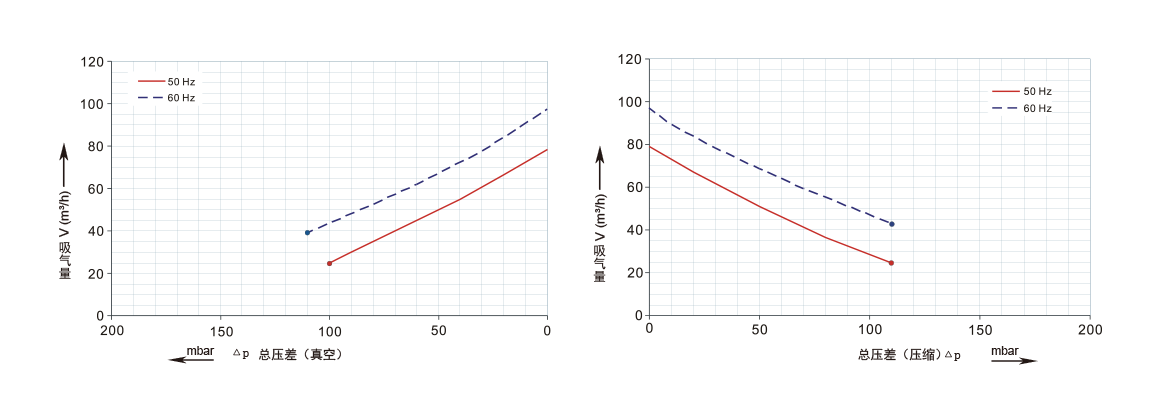
A pressure-flow chart shows the relationship between the airflow produced by the blower and the pressure or vacuum it can generate.
In most charts:
- The horizontal axis (X-axis) represents airflow, usually measured in m³/h or CFM.
- The vertical axis (Y-axis) represents pressure or vacuum, often measured in mbar or kPa.
Each curve represents the performance of a specific blower model.
A key principle shown by the chart is the inverse relationship between pressure and airflow:
- When airflow increases, the pressure decreases.
- When pressure increases, the airflow decreases.
This relationship defines the operating capability of the blower.
Main Areas of the Performance Curve
Understanding a few key points on the chart helps interpret blower performance correctly.
Maximum Pressure Area
The upper-left side of the curve represents the maximum pressure the blower can produce. At this point, airflow is very low because the system resistance is extremely high.
Operating continuously at this extreme is generally not recommended.
Maximum Flow Area
The lower-right side of the curve represents maximum airflow when the system offers very little resistance.
At this point, the blower moves a large volume of air but produces minimal pressure.
Normal Operating Range
The middle portion of the curve is the typical operating zone. Most industrial systems are designed so the blower runs in this region, where performance is stable and efficient.
How the System Determines the Operating Point
A blower does not operate alone. The final operating point depends on the resistance of the entire system, including:
- pipelines
- valves
- filters
- diffusers
- process equipment
As airflow increases, resistance inside the system also increases due to friction.
The point where the blower performance curve intersects with the system resistance curve becomes the actual operating point. This point determines the real airflow and pressure during operation.
Steps to Read a Blower Performance Chart
Interpreting the chart usually involves three simple steps.
Determine Required Airflow
Identify the airflow required by the application, such as aeration demand or conveying capacity.
Calculate Required Pressure
Estimate the total pressure needed to overcome system losses, including piping resistance and equipment pressure drop.
Locate the Operating Point
Find the point on the blower curve where the required airflow and pressure intersect. If the point lies within the curve, the blower can handle the application.
Applications Where These Charts Are Important

Pressure and flow charts are essential in many industrial processes, including:
Wastewater aeration – ensuring sufficient airflow reaches diffusers in treatment tanks.
Pneumatic conveying – providing the pressure needed to transport powders or granules through pipelines.
Vacuum hold-down systems – maintaining stable suction in printing, woodworking, and CNC machining.
Packaging machinery – supplying air for material transport and vacuum gripping.
Correct interpretation ensures the blower delivers stable airflow without overloading the motor.
Common Mistakes When Reading Blower Charts
Some common errors can lead to incorrect blower selection.
Ignoring system resistance – choosing a blower based only on airflow requirements.
Operating at extreme points – running too close to maximum pressure or maximum flow reduces efficiency.
Lack of safety margin – selecting a blower without allowing extra capacity for system variations.
Avoiding these mistakes helps maintain reliable operation and longer equipment life.
Conclusion
A regenerative blower pressure and flow chart provides a clear picture of how a blower performs under different conditions. By understanding the relationship between airflow and pressure, engineers can select the correct model for their application.
Proper use of these charts ensures the blower operates within its optimal range, delivering stable airflow, efficient energy consumption, and long service life.